Big Data, Big Impact: The Power of Data Visualization
“We live in a world of data. By now, any company, no matter what field, has to be dealing with data,” says Jason Schumacher, the head of Academic Marketing at Tableau, a software company that specializes in visualizing data. “If not for our own corporate analytics, then because anybody who does anything digital these days is a part of other companies’ large data programs, whether they want to or not. Our online behavior is measured. Some of these data programs’ ethics have been disputed, such as PRISM, but for the most part we can use data to analyze human behavior, and thus predict socially relevant and important events, changing the world for the better.”
As part of a partnership between the University of San Francisco and Tableau that was set up this summer, Schumacher visited USF’s School of Management for two days in early October to train students, faculty and staff in the use of Tableau and the importance of data visualization. “There’s a lot to say about data visualizations because yes, they’re fun, they’re nice to look at, but the most important thing you should know is that visualizations save people time,” said Schumacher during a presentation to graduate students at the School of Management. “We could spend hours explaining complex spreadsheets and lists of numbers to our coworkers or clients, or we can make the data visual in charts, graphs, and heat maps, and see in seconds in which direction the change is happening.”
School of Management Professor Mouwafac Sidaoui has been working closely with Tableau CEO Christian Chabot over the past few months to set up the partnership. “We want our students to learn how data visualizations can power business,” said Dr. Sidaoui. “Through working with software like Tableau, they are being provided with a unique insight into big data that used to be nearly impossible.”
The use of Tableau is not reserved solely for students in the Master of Science in Analytics (MSAN) program; any student with a USF email address now has free access to Tableau. USF and the School of Management strive for all students have the opportunity to work with cutting-edge technology. Professor Sidaoui teaches a Big Data elective course to MBA students, and will be teaching a data elective to undergraduate students starting in the spring semester of 2015. “By teaching them these professional skills now, we’re giving our students a competitive advantage,” he says. “Companies in big data are looking for interns and employees who already know how to analyze data, and who are fully prepared to utilize data visualization for informed decision making. Knowing and understanding this technology provides students with cutting-edge knowledge that allows them to secure the position of their choice in the highly competitive market of the Bay Area.”
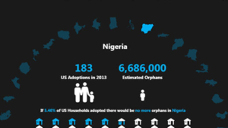
The partnership between USF and Tableau comes with more perks than free software use. “One of the most fun parts of the Tableau community, to me, is a website item called the ‘Viz of the Day,’” Schumacher explained to School of Management students. Every day, the Tableau website features a particularly well-designed visualization in the Viz of the Day section, as well as sending it to subscribed users via email. “The best part of this, other than design-inspiration, is that it’s a real opportunity to learn from other people’s advanced skill sets. If you like a viz, you can download the data set it was built on, and see how they did it. Any techniques that you like, you can then apply to your own visualizations.” On the screen, he pulled up a visualization called The Adoption Gap, which had recently been featured as Viz of the Day. Rolling the computer’s mouse over a circle of some forty-odd countries, information popped up about each country’s number of orphans, as well as how many U.S. households would need to adopt kids from that country to give each orphan a home. “This is more than a graph,” he said to the students. “It is an interactive infographic. And as you can see, when visualizations are done well, their power is that they don’t just show the viewer what they need to know, and quickly, but it actively engages them with the material.”